
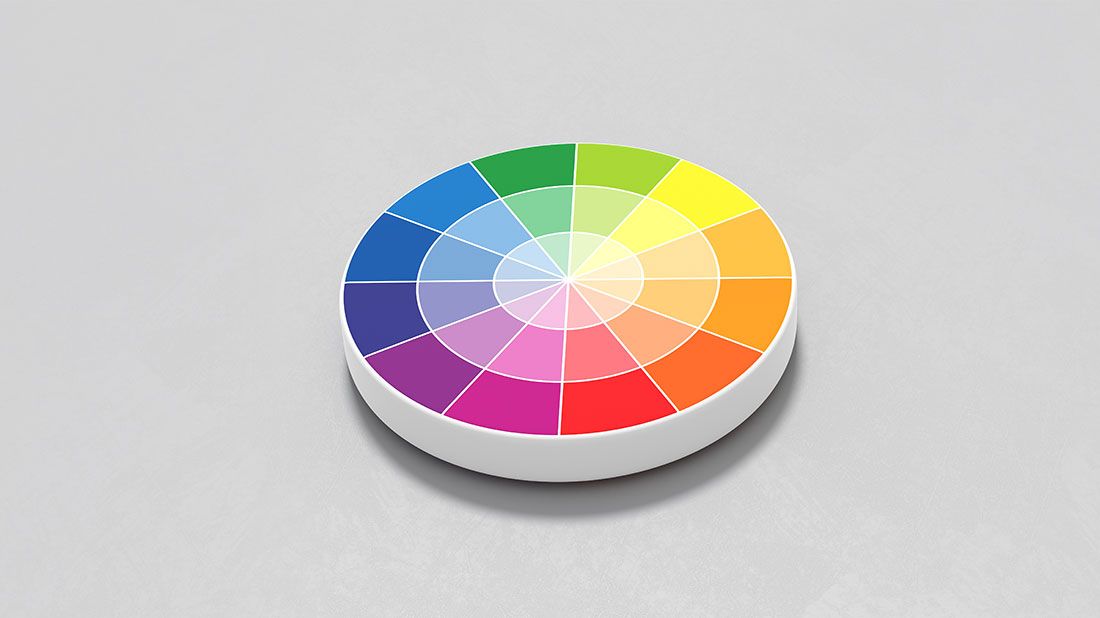
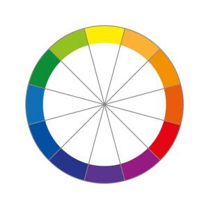
The color wheel is a visual representation of the relationships between colors. It is an essential tool in color theory that helps designers, artists, and anyone interested in color understand how colors work together. The coloring wheel is a circular diagram showing the primary, secondary, and tertiary colors and their relationships. Let’s explore the different types of color wheels, color relationships, color schemes, and color psychology.
Types of Color Wheel:
There are three types of color wheels: primary, secondary, and tertiary. The primary color wheel consists of three primary colors: red, blue, and yellow. These colors cannot be created by combining other colors. The secondary color wheel consists of the three colors created by combining two primary colors: green (blue and yellow), orange (red and yellow), and purple (blue and red). Finally, the tertiary color wheel consists of the six colors created by mixing a primary and a secondary color: yellow-green, blue-green, red-orange, yellow-orange, blue-purple, and red-purple.
Color Relationships:
Understanding color relationships is essential in creating color schemes that work well together. The three primary color relationships are complementary, analogous, and triadic.
Complementary colors – located opposite to each other on the color wheel. Combining complementary colors creates high contrast and is often used to create attention-grabbing designs. For example, red and green colors are complementary colors.
Analogous colors – located next to each other on the wheel. They are harmonious and create a sense of unity. Similar color schemes are often used to create a calming effect. For example, blue and green colors are analogous colors.
Triadic colors – They are evenly spaced on the color wheel. Triadic color schemes are vibrant and create a sense of balance. For example, yellow, blue, and red are triadic colors.
Using the Color Wheel to Create Color Schemes:
Color schemes are combinations of colors that work well together. There are four central color schemes: monochromatic, analogous, complementary, and triadic.
A monochromatic color scheme uses different shades and tints of a single color. It creates a sense of harmony and simplicity. For example, a monochromatic color scheme could be shades of blue.
An analogous color scheme uses colors placed next to each other on the color wheel. It creates a sense of harmony. For example, a similar color scheme could be blue, blue-green, and green.
A complementary color scheme uses colors opposite each other on the color wheel. It creates high contrast and is often used to create attention-grabbing designs. For example, a complementary color scheme could be red and green.
A triadic color scheme uses three evenly spaced colors on the color wheel. It creates a sense of balance and vibrancy. For example, a triadic color scheme could be yellow, blue, and red.
Color Psychology:
The study of color psychology shows how colors can impact emotions and behavior, as each color has a unique meaning and can evoke distinct emotions. Understanding color psychology is crucial for designers to ensure their designs effectively communicate the intended message.
For instance, red is commonly linked to passion, love, and energy, but it can also elicit feelings of danger and urgency. Marketers often utilize the color red to create a sense of excitement and speed in their campaigns.
Blue, however, is frequently associated with calmness, trust, and stability. Moreover, blue can also trigger feelings of sadness and coldness. Companies often employ the color blue in their branding to convey a sense of professionalism and reliability.
Although yellow can evoke caution and anxiety, it is often linked to happiness, optimism, and creativity. Marketers frequently incorporate yellow in their campaigns to create a sense of positivity and warmth.
Branding related to wellness and the environment commonly uses the color green, often associated with growth, nature, and harmony.
Using the Color Wheel in Logo Design
Logo design is an essential aspect of branding, and color plays a crucial role in creating a successful logo. Understanding the color wheel and color relationships can help designers choose the right colors for a logo that effectively communicates the brand’s message. For example, a logo for a wellness or nature-related brand may use green, which is often associated with growth and harmony. A complementary color scheme, such as green and red, could be used to create high contrast and grab attention. On the other hand, a monochromatic color scheme using different shades and tints of green could create a sense of harmony and simplicity. By utilizing the principles of the color wheel and color psychology, designers can create effective and memorable logos that communicate the brand’s message.