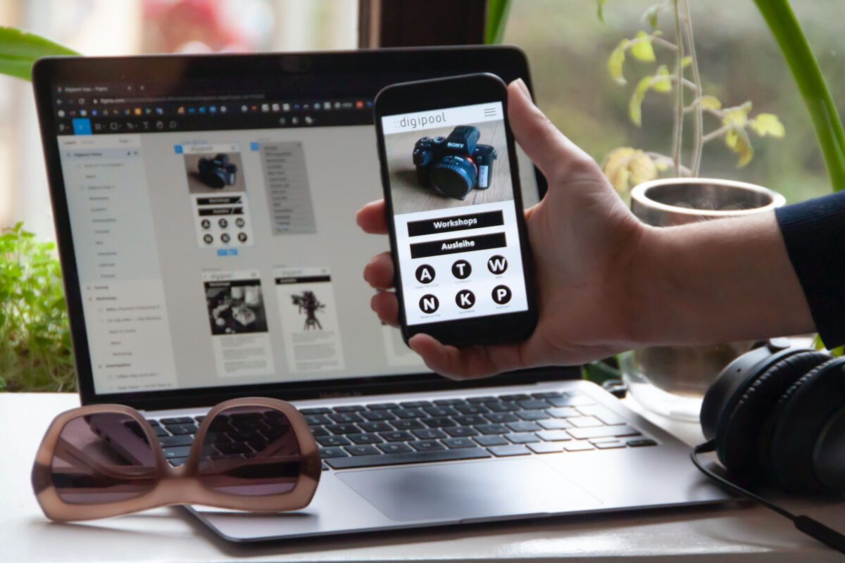
Around three-quarters of the world’s population will use mobile phones solely to access the internet. Now, that might be a simple statistic for anyone. However, for UI and UX designers and app entrepreneurs, it is big news, more of an alarm. Why? Because if their UI and UX designs are not apt according to the interface of a mobile, they are a danger. Now, that means they are prone to lose users. In addition, their quality and app performance might decline massively. In this regard, the Mobile-First Design comes into play.
Let us tell you more about the Mobile First Design! We will systematically tap into the details you need to know about the Mobile-First Design.
What Is Mobile-First Design?
In essence, the Mobile-First Design gives UI UX design of mobile devices due consideration. It is about prioritizing the mobile interface over the desktop interface. The very core motive is to fashion better user experiences on small screens.
The Mobile-First Strategy is primarily based on the idea of progressive advancement. Progressive advancement is an aspect of web design. It starts with the smallest screens and evolves further according to the size.
In the case of an existing website, we can check the distribution between mobile users and desktop users in Google Analytics to better understand the need for a mobile-first approach.
For a new website, you can check the market. Planning a business-to-business (B2B) website, you can assume that you’ll have more hits from a desktop since the audience will consume it from the office computer during work hours.
If it is a site intended for end customers (B2C – Business to consumer) – there will probably be more hits from mobile.
Understanding our audience and how they will consume the content is important.
In applications, on the other hand, it is very clear that the main consumption will be from the device for which we are developing the system.
Now, let us shed light on the merits of the Mobile-First Design.
Merits of Mobile First Design – Why It Is Important?
Mobile-First Design brings several benefits. Let us talk about a few of them.
First, it helps you to achieve high quality in your content. Because content is the primary focus. Ultimately, the visitor gets what they want. That leads to lower bounce rates, and your website ranks higher. Gradually, your website will become an authority over the internet, all thanks to the Mobile-First Design.
Secondly, with this strategy, you will achieve a good level of design efficiency.
How?
Because of this strategy saves product design time. Moreover, that ultimately boosts productivity. This way, it facilitates the designer a lot.
In addition, it eradicates graceful degradation, which consumes a lot of time and effort.
Next, this strategy enables you to focus more on the audience. In addition, it helps you to achieve a more focused audience. As your content is prioritized smartly, you tend to focus more on what your audience actually needs. Your potential visitors will get what they want fast. That will result in more leads conversion and long-term loyal visitors.
Lastly, you will encounter way fewer bugs.
That is because of this straightforward approach.
There will be fewer web elements and simple coding. Ultimately, that will result in less loading time and fewer glitches. Mobile-First Strategy will keep you away from all sorts of web complexities.
In addition, websites based on desktop browsers tend to have more bugs.
Let us be real! Mobile phones are taking over the internet. Now, if you do not take the Mobile-First Design, your website is prone to run into problems. That is why; it is time to make the most of this strategy.


