
Choosing between responsive design and adaptive web design can be difficult. Especially if you are new to the field of web designing, you might be curious to learn many valuable concepts, tips, and design ideas. As most businesses are switching to the online world, the competitive forces are rising high. In this scenario, your clients would expect interactive and flexible website design services from developers.
One of the biggest concerns for designers and business owners is understanding whether they need an adaptive website or responsive web design. If you are also confused about the difference between these design ideas, your search results helped you land on the right page. Here we have listed a few essential details about both these design ideas to boost your knowledge base.
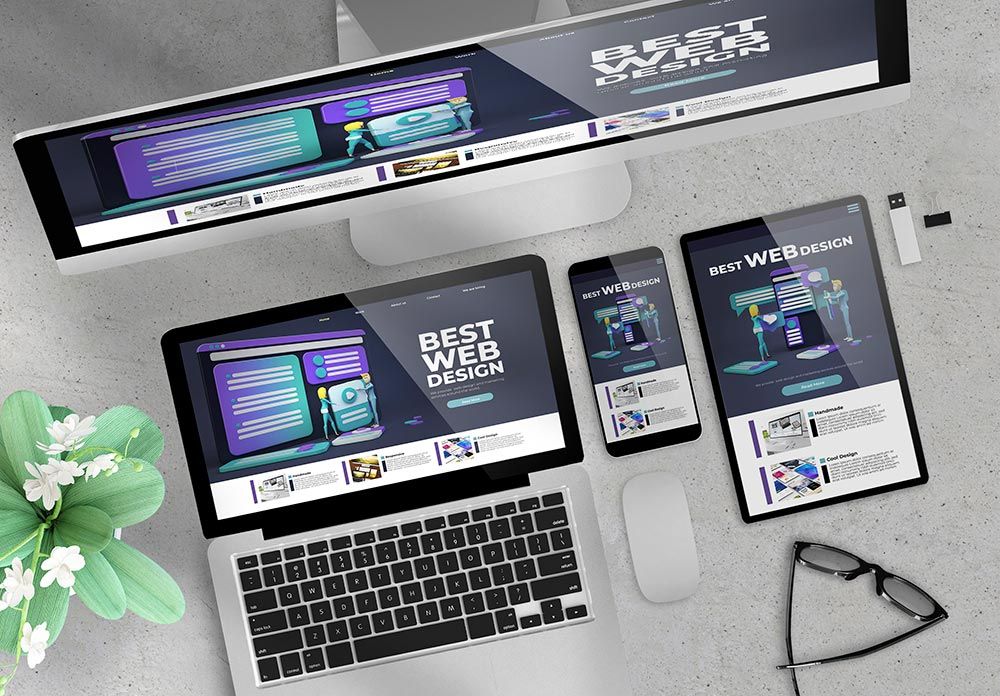
Responsive web design
The concept of responsive web design responds to the possible changes in browser width by adjusting the page elements in the available space. It means whether you open a website on the large screens of a desktop computer or the tiny screens of smartphones, the site will make ideal arrangements to accommodate design elements in the available space. Responsive web design allows users to grab essential information on your website irrespective of their device to initiate a search.
Adaptive web design
Adaptive web design appeared in the market in 2011 and is better known as the progressive website enhancement approach. On one side, where responsive web design is all about changing page design patterns per the available space, adaptive web design deals with multiple fixed-size layouts. When the website identifies the available space, it automatically selects the most suitable layout and perfectly fits the screen. It means you need not worry about resizing that can otherwise affect the design.
Choosing between responsive and adaptive web design
Responsive web designs are generally convenient to implement but offer less control for variable screen sizes. Many beginners prefer this option due to the many cheap templates on most website design platforms like Joomla and WordPress. Reports also reveal that sites with responsive design are search engine friendly, and websites flow easily from one device to another.
On the other side, adaptive web design ensures a top-notch user experience irrespective of interface type. Adaptive designs come with tailor-made solutions and can tune perfectly well with situational capabilities and needs. These websites appear more relevant to new-age users; however, responsive design is influenced by a desktop-centric approach. Adaptive websites can perform better on speed tests as compared to responsive ones. Therefore, it demands careful intervention to pick anyone out of adaptive or responsive designs.
When to use responsive designs?
- These designs are the best choice for small to medium-sized businesses.
- It is highly recommended for service-based industries.
- Budget-friendly and functional solution.
- Standard company websites with standard functionality
When to use adaptive designs?
- Adaptive design is the best choice for existing complex website designs, preferably the ones that require a mobile version.
- It is recommended for potential speed-dependent websites.
- An excellent choice for highly targeted user experience and enhanced control.
- The proper method for sites with applicative features and a level of complexity required separate development for mobile