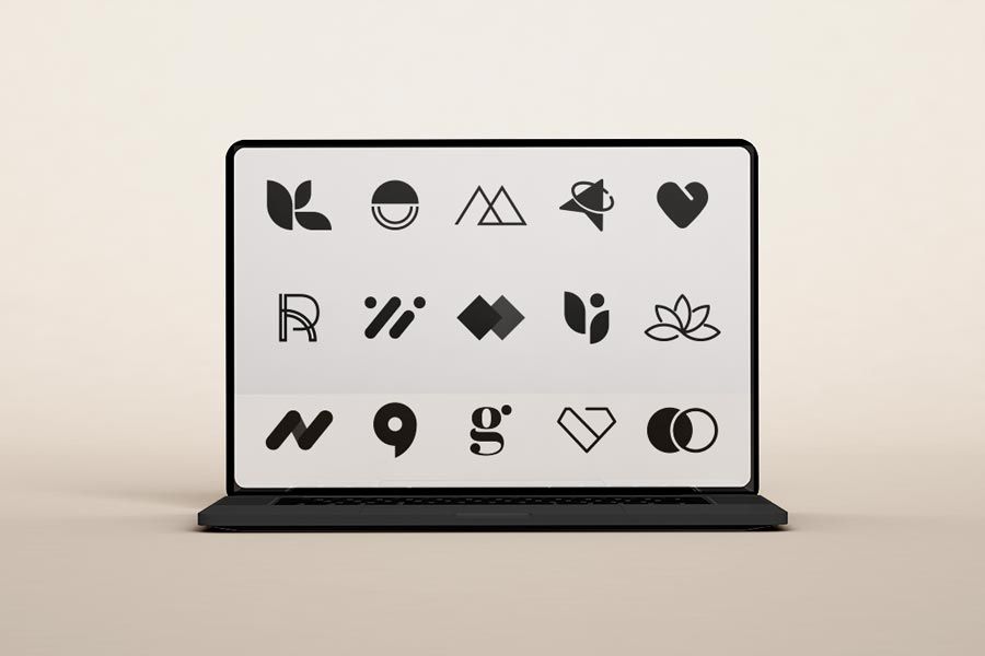
It is not a stunning Logo that makes the brand, but it is the brand that makes the logo stunning. If you are just starting a business or looking for a Logo – you probably want to read this article.
Here is a thought: Every house has a front door or a uniquely designed gate and bears a personal plate attached to it. It may hold a sign of decor and the names of the residents or even just a surname. The thought behind it is to create a lasting impression on the visitors since the door or gate greets them first. Moreover, the first-time visitors get a brief idea about the residents from the plate attached. Similarly, the logo acts as the first and the most widely circulated visual recognition of the brand. Symbols, letters, images, etc., can represent the logo. Therefore, it is essential to choose a unique logo for a business.
The three guiding steps behind choosing the stunning logo are:
1. Visual factors
Size
A logo needs to be prominent even when people look at it from a distance for the shortest period. Generally, a very small-sized logo may be overlooked or not garner any attention from the public. A standard-sized logo continuously acquires a positive response.
Colors
Colors often are administered by human psychological perceptions. People often associate neutral hues or standard colors like light blue, grey, or white with companies dealing in the medical and financial sectors. On the other hand, restaurant chains, multiplexes, garments brands are sources of luxury and relaxation for people, so brighter and more robust colors are more relevant for them.
Style
Writing style should always be eye-catching, whether a symbol or a letter or even a group of symbols or words. For example, The selection of font styles can be more adventurous or light-themed when it comes to logos of restaurant chains, especially that of fast-food joints, cafes compared to five-star hotels or even pharmaceutical companies.
Image or symbol
Image or a symbol in a logo gains more significance if associated with the primary subject matter that the brand is dealing with, like an element representing the products or service. For example, a fork and a spoon are often part of a dining restaurant logo.
2. Direct connection with the brand
The logo representing the brand needs to connect directly. It may express a principle the brand is associated with, or abstractly present a sense of value. For example, a human figure running can play a significant role in the logo of a fitness chain – representing the principle of staying active to be fit. A good logo sometimes even represents a brief story of the inception of the brand. People often find the above concept more personal and get drawn towards it. A few logos even have the year of incorporation mentioned. Prospective clients often find it easier to trust a brand by its logo when they know the number of years serving the public.
3. Instant recognition
Brands often belong to individuals who run businesses using their professional expertise. It is beneficial for them to use their first or last name as a part of their logo for instant recognition. If a boutique or a store or a label owned by a fashion designer has their name in the logo or even a pharmaceutical company has even the last name of the doctor, the fashion enthusiasts and the patients respectively will have no problems associating the above in the proper manner.


